Ten attempts, one diagram: what fixing an AI-generated image actually taught me
Diagrams and slide layouts are two things AI seems stubbornly bad at. Across every blog post I've worked on this year, diagrams have been a consistent challenge - there's always a cut-off edge, an overlapping box, or some other problem that means the first result is never the one that ships. This is with LiteLLM giving me a wide selection of providers to pick whichever model is best at diagram generation on any given day, and it still gets it consistently wrong. Slides have the same shape of problem from a different angle - when I'm working on a deck, the words are generally fine, but the layout is terrible: text hanging over the edge of a slide, or a diagram using a third of the available space while the rest sits empty. In Google Slides I can go in afterwards and fix the layout myself, and it's not a terrible experience. But why can't the model do that for a whole deck in the first place?
I asked Claude Code to generate one for a blog post about Auth0's On-Behalf-Of token exchange: five boxes, Customer through Login App, Auth0, Bridge Service, and Intercom, with a caption under each arrow and a small callout showing the sub/act claims, generated with gpt-image-1 through our internal LiteLLM proxy. A simple diagram, by any normal definition of simple.
It took Claude ten regenerations to get it right, and the actual lesson wasn't about the model being bad at diagrams in the abstract - I already knew that going in. It was that every fix for one specific defect reliably introduced a different one, somewhere else in the same image, almost every single time - and that the fix everyone would reach for first, cutting content until the render stops breaking, is the one that can quietly cost you the point of the diagram entirely.
The first two attempts got the mechanics wrong
Claude's first prompt described the flow in the order you'd write it in prose: Login App talks to Auth0, Auth0 issues the exchanged token, Bridge Service uses it. That's not what actually happens - the Bridge Service is the one that calls Auth0's token endpoint, not the Login App - and the model drew exactly what the prompt described, wiring the arrow between the wrong two boxes. The prompt was wrong, not the model, and I told Claude as much.
The second attempt was where it over-corrected. Claude wrote a much longer, more explicit prompt describing exactly who calls whom, including a curved loop-back arrow from the bridge service to Auth0 and back. Two separate kinds of problem showed up at once: a purely cosmetic rendering fault (blurred, glowing at the edges, the kind of thing that makes an image look unfinished but wouldn't change what it's saying) and genuine content errors that made the diagram wrong, not just ugly - several labels misspelled ("teken exchange endpeint", "hoids" instead of "holds", "custonet-td" instead of "customer-id"), and the fifth box, Intercom, missing from the image entirely.
Simpler was more reliable than more precise
The third attempt is where the first real progress showed up. Claude stripped the prompt back to the simplest possible description: five boxes in a straight row, one arrow between each adjacent pair, no loops, no curves, one caption per arrow, one short callout underneath. Every label came back spelled right, every arrow pointing the right way, no visual artefacts - a genuinely clean render, on the first try, of a still-incomplete brief.
The same simplify-the-prompt pattern repeated on a second, unrelated diagram for the same post - a CIBA step-up approval loop, genuinely more complex since it has an actual round trip (chat message out, phone approval back). Claude's first attempt at that one invented a phantom fifth box with a garbled glyph in place of the word "Approve" that wasn't anywhere in the prompt. The second, simplified attempt came out clean.
Two diagrams, two first attempts that asked for full architectural precision, two results with real defects. Two simplified retries, two clean-looking results. "Clean-looking" is doing some work in that sentence, and it's the reason this post has two more sections after this one rather than stopping here.
Fixing one small thing was the hardest part
The real surprise came later, when I asked Claude to look at the first diagram again after it was already sitting in the draft. A stray, unlabelled curved line trailed off from the "Customer" box into empty space - a leftover artefact from an earlier version of the prompt that had never been fully removed. One specific, isolated defect, in an otherwise-correct image.
Fixing just that one line took four more regenerations. The first attempt removed the stray line, but deleted the arrow between Customer and Login App entirely and duplicated a caption that should only have appeared once. The second, with much more explicit per-arrow instructions, brought back a glow artefact and truncated the callout box's text. The third, back to the simple prompt plus one targeted "leave that area blank" instruction, fixed the stray line but truncated the callout text again, differently - "bridge servi" the first time, "bridge seric" the next.
Every one of those regenerations fixed the thing Claude had been asked to fix. None of them was a strict improvement on the version before it - each one traded the previous defect for a new, different one, somewhere else in the same image.
The eighth attempt fixed the render and broke the point
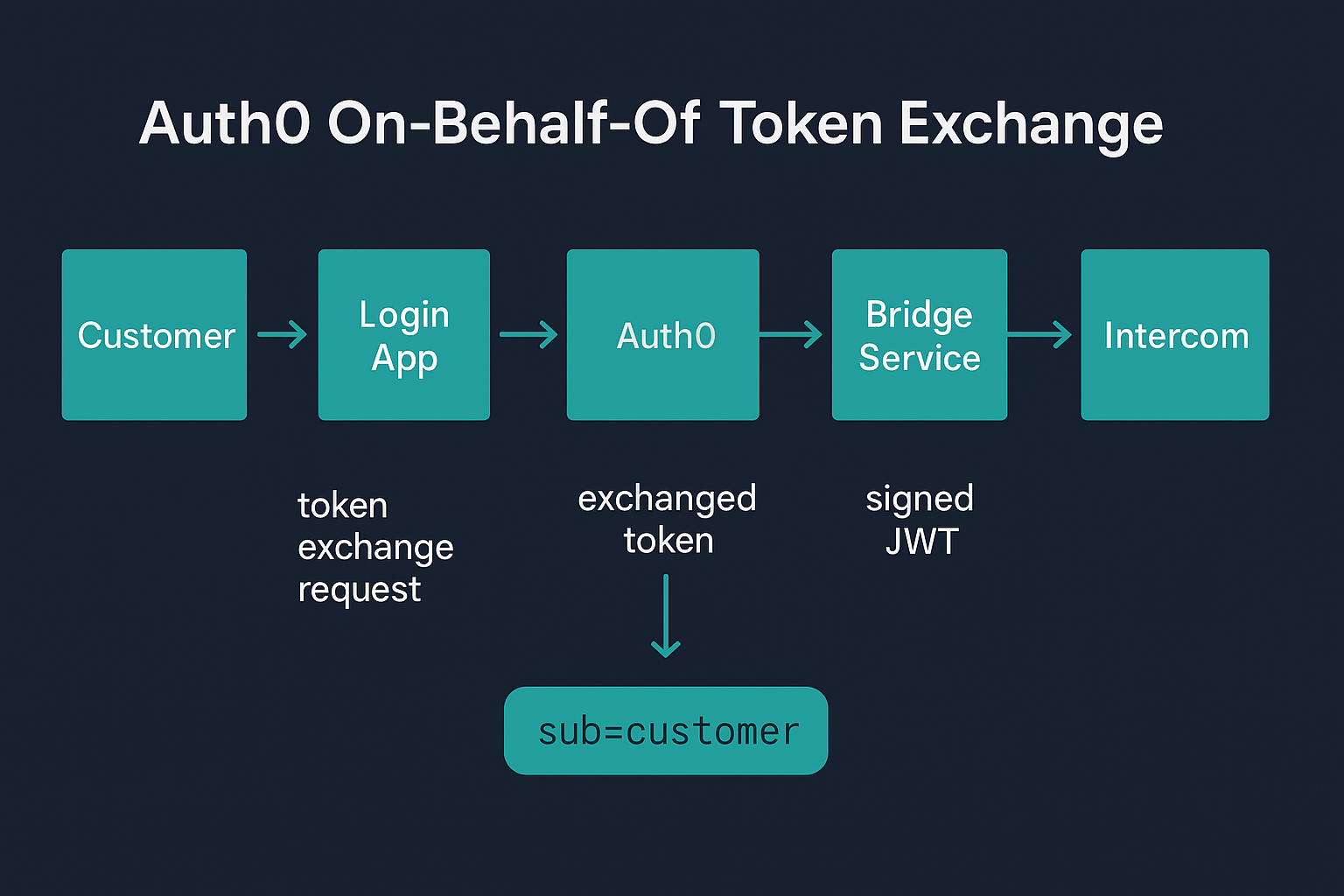
At this stage Claude stopped trying to get one perfect image out of an increasingly specific prompt, and shortened the content instead. The callout box had been trying to show two lines - sub: customer and act: bridge service - and that second line was the one that kept getting mangled. Cutting it down to a single short line, sub=customer, and dropping the act half entirely, produced a genuinely clean render: right arrows, right labels, right spelling, no stray lines, no glow. It shipped in the post looking like the fix.
It wasn't. sub and act are both claims inside the one token the whole post is about - that's the actual mechanism, a single access token carrying both who the customer is and which service acted on their behalf. A diagram of that flow with only sub on it isn't a simpler version of the right diagram, it's a diagram of a different, less interesting claim. I caught it myself on a second read of the published post, not before it shipped - the version with only sub had already gone out the door.
Two boxes wasn't the fix either
The first attempt at putting act back split it into two separate small boxes side by side, sub=customer in one and act=bridge in the other, each spelled correctly with no truncation. Better, but still wrong in a different way: two boxes sitting next to each other reads as two separate things, and the entire point is that they're not separate - they're two claims inside one token. Worse, neither box was connected to anything, so nothing in the image tied them back to the exchange step that actually produces them.
The version that finally worked put both lines inside a single container, explicitly labelled "one access token," with an arrow running directly from the Auth0 box into that container - the same visual language the rest of the diagram already used for showing where something comes from. One request to the model, one clear ask: both claims, one token, connected to the step that issues it.
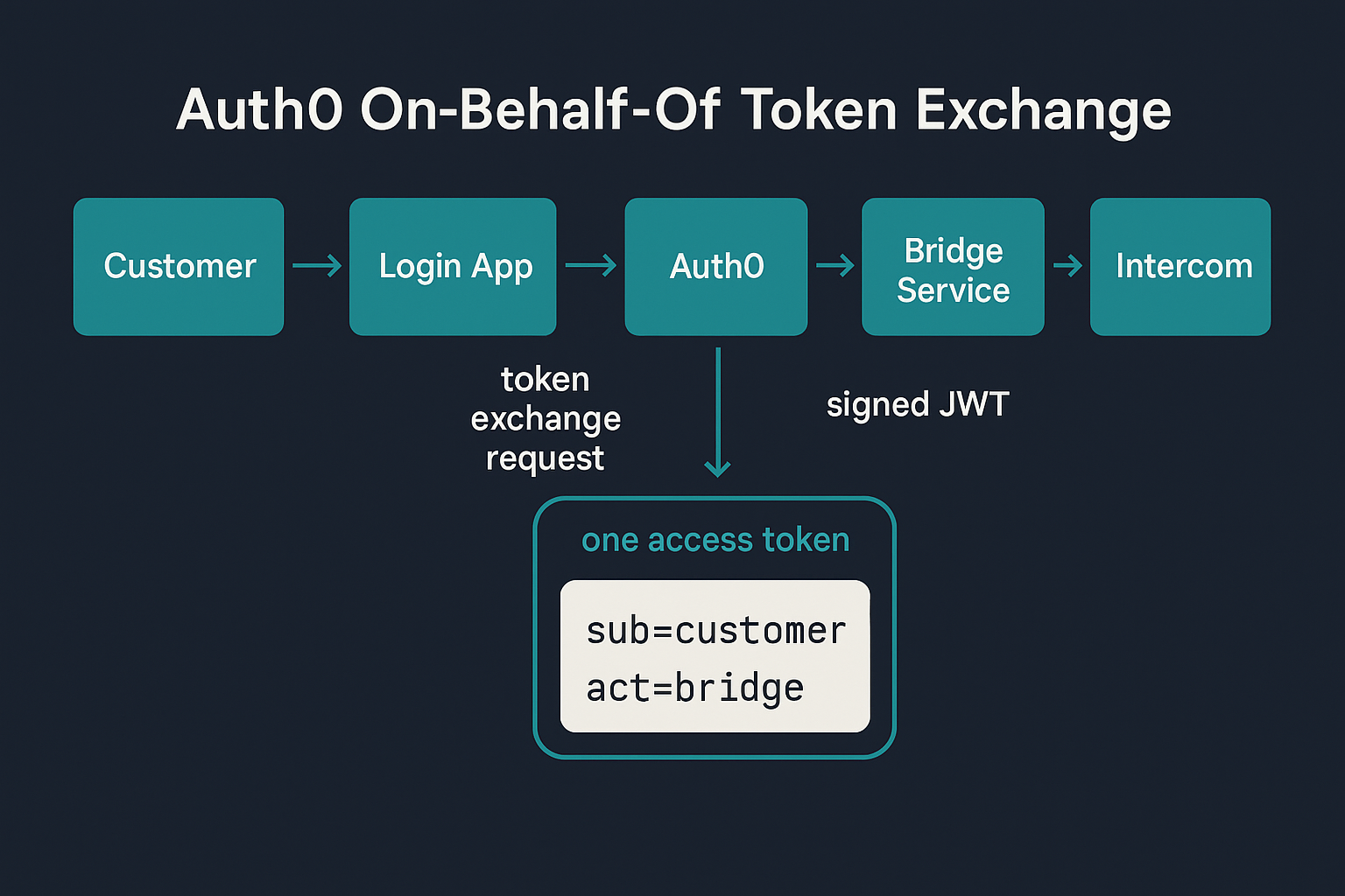
That's what shipped in the original post in the end.
Final Thoughts
The instinct when an AI-generated image has one thing wrong is to describe that one thing more precisely and regenerate. Across most of this, that instinct was wrong - a more detailed prompt fixed the named defect and reliably cost something that hadn't been asked to change, and simplifying the prompt was consistently more reliable than adding precision to it. But simplifying the content of the diagram is a different move entirely, and it's the one that actually bit me: dropping act to get a clean render fixed the image and quietly broke what the image was for. The fix that held up wasn't less content, it was better structure - one labelled container instead of two disconnected ones, with a single arrow making the connection I'd been trying to state in a caption. If a diagram keeps breaking, the answer is closer to changing what the boxes represent, not to leaving one of them out.